Having an effective call to action is an essential part of any website but many designers are unable to use them effectively. Over the years marketing expert, Waseem Saddique has overseen numerous marketing projects; here he explains how to utilise call to actions effectively by encouraging users to act.
Every website should have an objective; either to get users to complete a contact form, volunteer their time or sign up for a service. If used effectively a call to action provides focus to a website and gives users direction.
“Before a user is willing to complete a call to action they have to recognise the benefits. So first identify a problem and then present a service or product that solves that problem. Highlight the benefits of responding by telling users what they will get out of completing the call to action,” advises Waseem Saddique.
Too many call to actions can overwhelm the user. Supermarket studies show that when a shopper is presented with too many varieties they are less likely to make a purchase, the same can be applied to call to actions.
“Limit the number of choices a user has to make. It is better to use a small number of effective call to actions rather than using several that confuse the user in turn driving traffic away,” explains Waseem Saddique.
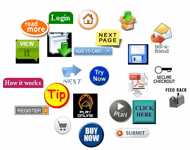
A call to action should clearly tell the user what to do. Words such as; Buy, Call, Register, Donate, Subscribe all encourage users to take action. A sense of urgency can also be created to make users act.
Ideally your call to action should be placed high on the page; “place call to actions above the fold. This way users will see it as soon as you website is opened,” states Waseem Saddique.
Take into account the space around the call to action; “the more space around a call to action the more attention is drawn to it, by cluttering the space around your call to action and it will be lost,” continues Waseem.
Studies show that colour is an extremely effective way to gain attention. Many designers have a colour palette for their site however then design call to actions within that palette. Using a lone colour for call to actions will allow them to stand out.
Findings by Jakob Nielsen show that plainer graphical elements get more attention, because they are more closely associated with native site content, that is graphics that feel like they belong to the site, that look like they have a purpose and value.
“An effective call to action is essential for the success of a site and involves drawing together best practice in usability, creative visual design and powerful copy writing,” explains Waseem Saddique
If call to actions are done right they can generate real measurable return on investment.